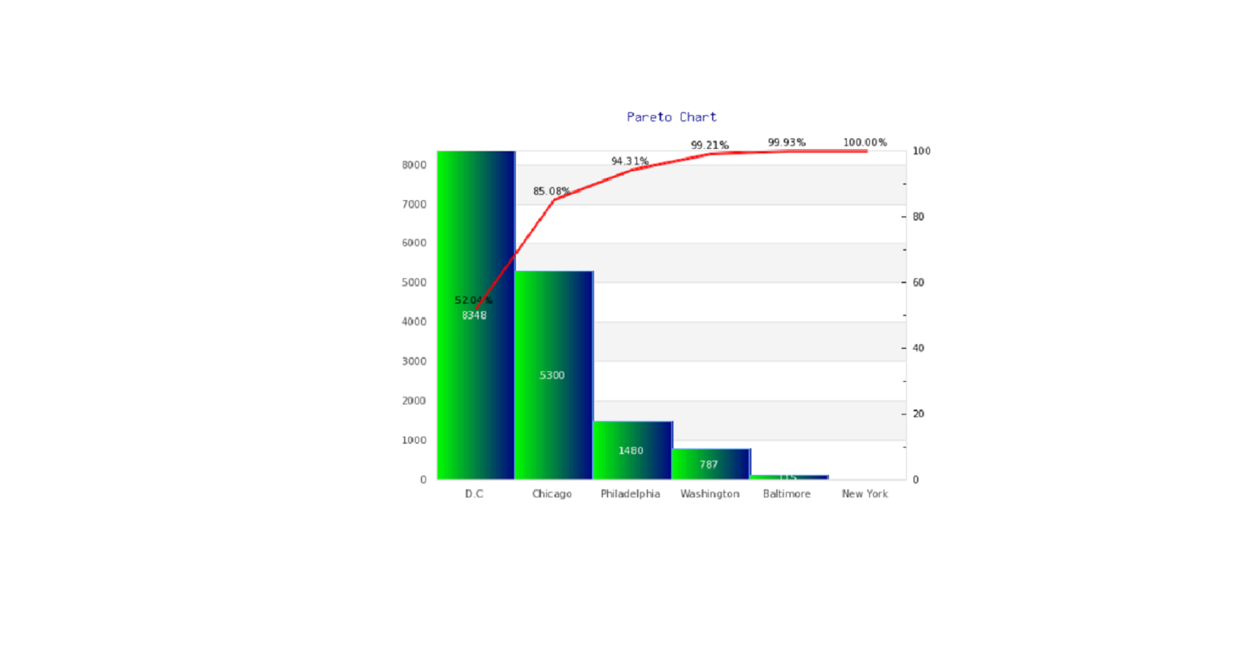
Arrange the data from the largest to smallest according to frequency.
CityD.CChicagoPhiladelphiaWashingtonBaltimoreNewYorkNumber83485300148078711511Draw and label the x and y axes.
Draw the bars corresponding to the frequencies.
The Pareto chart shows that assaults had the highest frequency and homicides the lowest.
Total=8348+5300+1480+787+115+11=16041
160418348⋅100%=52.04%
160415300⋅100%=33.04%52.04%+33.04%=85.08%
160411480⋅100%=9.23%85.08%+9.23%=94.31%
16041787⋅100%=4.91%94.31%+4.91%=99.21%
16041115⋅100%=0.72%99.21%+0.72%=99.93%
1604111⋅100%=0.07%99.93%+0.07%=100%
CityD.CChicagoPhiladelphiaWashingtonBaltimoreNew YorkTotal=Number8348530014807871151116041Cum.Relative Frequencies(%)52.0485.0894.3199.2199.93100 Therefore, the following Pareto Chart is obtained based on the table above: